haveged - A simple entropy daemon
Processor Flutter - Part 1

Haveged provides a block level interface that is accessed either directly through the file system or indirectly through random device ioctl block transfers triggered by a low entropy condition. In either case, haveged output consists of transferring 32 bit words from an 8MB collection buffer to the destination. The collection buffer is filled by a HAVEGE adaptation that uses two 32 bit samples from a high-resolution timer to generate every 16 words (32 bytes) of buffer content. The fill process is designed to be particularly sensitive to the hidden state of processor cache mechanisms which is expected to result in variations in timer readings ("flutter") during the fill process.
This study attempts to analyze "flutter" as it appears in the haveged collection loop. A few preliminaries are needed first:
- A timer input will be referred to as a "TICK", a 32 bit value in the range of 0 - 4,294,967,295.
- The position in the haveged collection buffer will be referred to as a "STEP" The haveged collection buffer contains 1M 32 bit words identified by STEP values of 0 to 1,048,575.
- Samples are collected using the "CAPTURE" diagnostic mode of haveged. This diagnostic build is identical to a production build but does introduce additional sampling logic to be executed for every two timer samples. An inspection of the generated assembly language provides an estimated increase of less than 2% in the execution path. CAPTURE effects cannot be detected in elapsed time tests.
- Sample size will be fixed at 16MB, the same as used by the other haveged statistical tests. Samples of this size should create data value rollovers on both the STEP and TICK axis. In the case of CATPURE output, repetition of the collection loop must be repeated 8 times as often to satisfy the request range.
- Experiments will be repeated over a several processor types expected to exercise the sensitivity of the collection loop. Sorry, only Intel hardware available at the moment.
- Analysis will be performed by gnuplot and the R statistical package.
Flutter in the Wild...
A scatter plot is often used as the preliminary investigation into a new data set. In this case, a small external utility was used to read a 16MB data set, divide the entire 1M x 4G space into 512 x 2048 bins, and accumulate the occurrences of STEP/TICK into those bins in order to create a data file for input to gnuplot. Since a timer is a linear device, collection passes would be expected to appear as roughly linear traces in the STEP/TICK plane. Remember that each sample contains 16 collection passes.
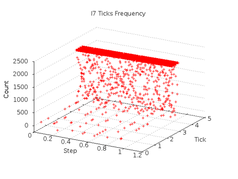
The initial plot is shown at left for an Intel I7. The linear nature of the collection passes is apparent, but the granularity of the collection bins obscures much detail. The slow drift of the TICK bands to higher values is the result of the monotonic behavior of the high resolution timer. TICK magnitude is determined by the value of the processor time stamp counter at the start of the run. The experiment is otherwise repeatable - TICK values appear tightly clustered with mostly rare variations.
The results of the experiment repeated on a slightly slower machine are
shown below. Parallel bands of TICK values are clearly present.
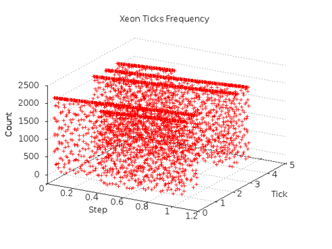
The initial values in the Xeon CAPTURE are located in the third band from the TICK origin. The effects of TICK rollover are clearly visible, although the appearance of only five distinct bands is unexplained. Clustering of data values with some variations appear to be consistent with the plot above.
What happens at even slow processor speeds? The result of repeating
the experiment on a even slower processor is shown below.
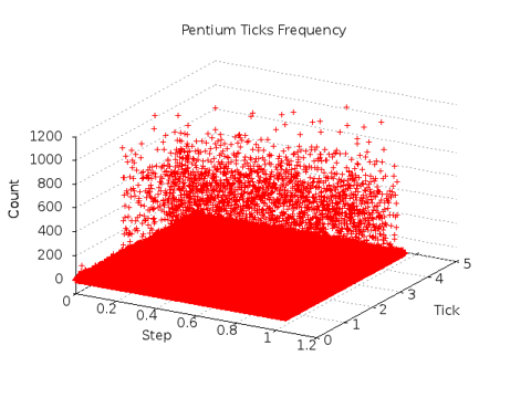
If there are any linear traces of collection passes in the plot at left, they are totally obscured by plot density! Both the low occurrence peak values and the loss of any linear detail indicate that the algorithm operates in a very different manner on this machine. It so happens the this machine was the machine used for the original haveged development!
A More Detailed View
More detail can be extracted from the above data sets by exploiting the the expected linear behavior of the TICK values. This is accomplished by using the difference between successive TICK readings. For a monotonic source, the difference between successive readings are should always positive and the log10 of the difference can be used to compress the expected large variations for more convenient analysis. This was accomplished with a minor alteration to the data preparation utility.
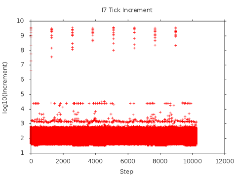
The result of this technique applied to the previous I7 data set is shown at left. The tight band of the bottom of the plot represents the variations from a linear timer with a slope of approximately 500 TICK/STEP.
Other points are probably collection loop artifacts - perhaps due to the CAPTURE logic itself. Although these effects cannot be quantified, the net effect of these artifacts appear minimal in a collection of 4M TICK values.
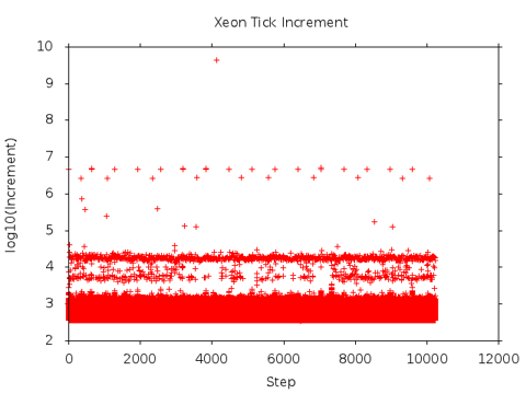
The Xeon plot is clearly related to the one above. The primary band appears to be the result of a timer with a slope of approximately 800 TICK/STEP.
Movement of the outlier bands suggests that these effects result because of the interactions between timer rollover and multiple buffer fills.
The final plot shown below is the most interesting. The banded appearance
confirms the presence of linear sampling effects.
However, the band of large variations (more than 10^7) is a unique feature that
can only only be explained if timer values are NOT monotonic in this case.
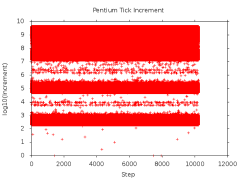
A closer look at the data set confirms that the 32 bit timer values decrease in 15% of the cases. These decreases are often observed in runs of several successive readings. This cannot be a timing effect. The most probable explanation is that these decreases are the result of out-of-order execution effects in reading the processor time stamp counter.
This interpretation is certainly consistent with the previous three-dimensional plot of the Pentium data set. The upper band aside, the familial resemblance to the other plots in this series is apparent.
This analysis is extended further by importing the same data into R in part 2.